There were ferns and moss growing in between the tiles that had long since come detached from the concrete floor. Sunlight streamed through the leaking roof creating interesting shadows in this massive 78,000 sq. foot space. The smell of mold was overpowering even with the required mask. It was quiet, desolate even—the calm before the storm. Exactly one year later, on December 10th 2017, 3800 people piled into this building for the grand opening of our new church home.
Where others saw an albatross that ought to be demolished, Mosaic saw a great deal on a centrally located building with a thousand parking spots and easy highway access. Where others saw a building too big for retail in the post brick and mortar age of Amazon.com, Mosaic saw a big box store just begging to be chopped up into kids classrooms, a worship space and a lobby big enough to support our “hang around and talk over coffee” culture.
“How do you take an ugly old department store and turn it into a home for a church community, and a catalyst for world change?” asked the pastor? “How do you make what is inherently big feel human and accessible again?” That was the big question that we kept in the forefront of our minds throughout the entire project. Here are a few things we learned along the way that might help your building project no matter what the sq. footage is.
Your front door really matters.
You know why they call them big box stores? Because they look like a big ugly box! It’s the tyranny of the efficient as a building style. The budget would have told us to go cheap on the front and put our money inside the building where the real ministry happens. But we pushed back on that and dressed the front of the building with real cedar touches and bright colors that began to tell the story of the church even before you got to the doors. We took signage seriously, recognizing that the front of our building had the potential to be a rent-free billboard on the side of a major thoroughfare with 50,000 cars driving by every day.
The large cement courtyard area in front of our building could have felt post apocalyptic, but we humanized it with (donated) Sylvester Palm Trees, outdoor couches, café tables and even a corn hole game that doubles as a promo for student ministry. Before you even walk through the front doors of our building you see community and family and you want in!
People just want to know where the toilet is.
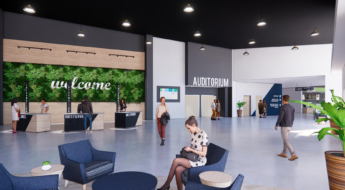
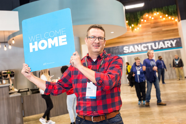
It’s super annoying to walk into a big building and not be able to find what you are looking for! So we asked ourselves, “what are our mostly suburban families trying to find when they walk in the front doors?” The answer . . . kids Ministry check-in, Seats in the main worship space, coffee, and yes, toilets . . . that’s it! So, we borrowed a page from the Disney World’s hub and spoke model (we are in Orlando after all) and let everything radiate off the main lobby in a simple and straightforward way. As soon as you step into the building, you see large, well designed, clear signs showing you where the bathrooms are, where the sanctuary is, where kids get checked in and where the all important coffee can be found. Signage is relatively cheap. It’s just plastic with big stickers over it that anyone with a basic knowledge of photo shop can design. Way finding signage and clearly labeled large rooms helps undo that feeling of being new and not knowing what the heck to do. That feels like gospel to me and yet it’s just a sign.
Don’t go cheap on your lobby!
As pastors, don’t we hope that our people will do more than just attend a gathering on Sunday and then leave? Don’t we tell them in various ways to move beyond attending to belonging? Yet so often, churches are designed with common areas that are far too small once you add info tables and coffee carts and a sign up booth for the women’s retreat, etc. Your lobby can and should be more than just a hallway from the parking lot the sanctuary! We intentionally created space for community to happen on accident. Throughout our lobby, you’ll find comfy chairs, couches and bar height tables accented by wooden pergolas, cedar touches, Edison bulb lighting and (fake) plant life bursting out of the walls (kind of like it was when we found it but now it’s on purpose!). We didn’t do all this to pander to a consumer culture looking for the next new thing. We paid attention to design because we worship a creative God who seems to make really beautiful things. ‘Oversized dentist office’ is not a design aesthetic you should strive for. We chose to work with a theming company called Plain Joe Studios for our lobby and kids spaces due to the size and scope of our project. But all you really need is a clear vision of what you want the lobby to feel like (ours was ‘refined industrial’) and then stick to that vision. Our lobby spaces look gorgeous in a very familiar way, you instantly feel at home, but it cost us less than 1% of our total budget to accomplish that look and feel! I promise you that you’ll have to fight to keep that 1% more than any other part of your budget!
Skip the offices if money is tight.
Almost every building project has that HGTV moment where the architect and builder sit your design team down and say “Ok folks, this is what you want . . . and this is what you can afford”. That’s usually where the bad decisions start. You cut classrooms, or sanctuary size or that lobby that everyone thinks is too big. All of these decisions are short sighted and lack creativity. Question: How many of your staff have a laptop computer paid for by the church? My guess is that the answer is something like “all of them”. So if you build that big lobby I keep arguing for, and you buy some nice couches and chairs for said lobby, couldn’t you just ask the staff to use that for a while until you can afford offices? “But where will we do private meetings?” someone is asking. “Where will we do counseling?” More than likely, if your church is growing, you have a lot of kids in it, every – single – week. So why not take some of the classrooms you are building for them and let them do double duty during the week as private meeting rooms that anyone on your team can use? Just put some nice adult chairs next to those tiny little plastic pre-k chairs and you’ll be fine! The people in your church will praise your ingenuity and frugality. You can say pious things from the stage like “We chose classrooms over offices because children are our future!” It’ll be great. Trust me.
You had me at R.O.I.
As an Executive Pastor, Return On Investment (ROI) is a phrase that I’m contractually required to love. We found a lot of places in our building project that required a bigger upfront investment but had a really amazing pay off within 12-24 months.
Be sure to talk with your builder about doing every single light in LED. This added 30% to our lighting budget, but when you look at replacing all those bulbs, not to mention the added heat kicked off that now that has to be cooled down and you can see how the ROI on LED lights everywhere pays off in about 18 months. Plus, you are not paying a human to constantly change bulbs.
If you find a few bucks extra, take a look at really nice Dyson style hand dryers instead of paper. Your people will be mad at you for it, but you can just chalk it up to good stewardship and mention it in the next annual report as ‘creation care’ or something equally brandy.
Lastly, consider an LED screen wall for your stage area over traditional projectors. The cost of LED panels is dropping so fast! For us, it was literally the last major decision we made for our building project and we didn’t make it until less than three months before opening the doors. In the end, we spent about 20% more to purchase an LED wall instead of projectors, but again the ROI is about two years when you consider the cost of replacing very expensive projector bulbs about once a year. Plus, it’s looks amazing!
At the end of the day, buildings come and go. They are nothing more than a tool to be used up for a season. But they can also be a catalyst for world change and a platform for amazing gospel centered community. If you have the privilege of owning a building when so many pastors are living the set up and tear down groundhog day, do all you can to let that physical space represent the glory of God in all of His creativity and beauty.


