I’ve been posting a lot about our generosity initiative over the last few months. In fact, I haven’t really been posting about anything else because this project has been dominating my days and nights. Today I want to talk about stage design for a generosity initiative.
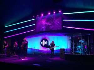
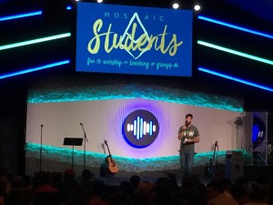
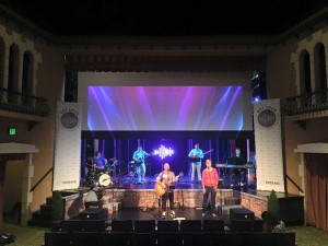
Like many churches, we re-do our stage design several times a year. Sometimes it’s a quick adjustment to keep it fresh. Sometimes we start with something simple and then layer on more for a holiday like Christmas. And sometimes we strip it down to zero and start fresh with a whole new design. As we approached the public phase of our generosity initiative, we wanted the stage to fall in line with it and feel like it “matched” the overall look and feel. I also needed it to feel like a really important shift, like it was the biggest thing we had ever done before. I wanted people to walk into the sanctuary and say “whoah, something big is happening”. I told our design guys to make the stage design feel like the biggest design we’d ever done.
We accomplished all of this in a few ways.
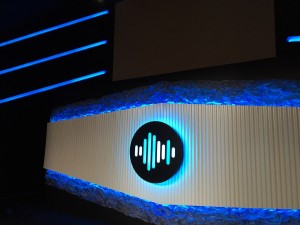
1. We brought the Get Loud waveform logo in the design of the stage and made it the center of the stage and lit it up with controllable LED strips on a dmx box. (I hope I’m saying that right?)
2. We stretched out from the waveform logo with simple corrugated plastic cut into a shape and mounted on the wall with more LED strips behind it creating a huge lit up area that we could shift through color patterns on the screen.
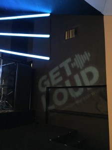
3. We used a GOBO light to project the logo onto one side wall and balanced it on the other side with a cross that tends to move around on the stage based on the current design.
4. We made the whole thing feel taller by adding giant lights up high on the stage, each on a separate dmx controller. These lights look intense and expensive, but they were actually pretty cheap. They are just metal studs with diffusion paper over top and LED strips laid into the bottom.
The whole effect sent the appropriate signal, “these guys are serious, it’s time to Get Loud”.
So, how much did it all cost? $847 bucks! That’s it! I had a professional stage designer tell me that he figured we spent thousands on it. I was really pleased with how it turned out. And my role as XP was pretty minimal. I gave the direction to do it. They came up with the design. I approved it and the team executed their awesome ideas. If you want more info on this project, you can email Jeff Amato.
It’s worth noting that at our set up and tear down campuses, w could not do all of the same work, so we utilized retractable signs along with the same logo you find in the above pictures to mimic the look. Check it out below. I think it worked.


